
Week 10: Type & Page
- bethgaleckyj
- Apr 3, 2023
- 7 min read
Updated: Jun 15, 2023
How can typographic conventions and design inform and imbue the meaning of a given text?
Lecture
This weeks lecture regarding typography was presented by Kristoffer Soelling, who gave us a lot of good insight into the history of typography, its evolution throughout the decades and its place in modern times.
Before this lecture, I didn't know much about typography other than some of the history of the printing press and a little bit of terminology regarding the anatomy of the letters; and so I was very interested to hear more about how it came to be what it is today, and furthermore, how it has become a powerful and essential form of communication for graphic designers.

Fig. 1- Evolution of font types https://flex.falmouth.ac.uk/courses/1165/pages/week-10-lecture?module_item_id=63447
Brief History
In Germany 1440, Johannes Gutenberg had invented the first moving-type printing press which had in turn revolutionised the printing industry and had kickstarted our ability to create everything we see today- from newspapers, to magazines, to books.
Before the printing press, everything was handwritten by trained scribes, which meant that it would take a long time to complete a whole book, and in turn, meant that the books were so expensive that only the wealthy could afford them.
The way in which the moving-type printing press worked revolved around the process of transferring ink from movable type to paper.
First, a worker would choose out the letters and symbols from the lower and upper case compartments and would arrange the letters and symbols into a sentence. These sentences would be arranged and displayed over a flat wooden plate called the 'lower platen'.
Ink was then applied to the moveable type and a sheet of paper was laid over it. Using a hand crank, the 'upper platen' was lowered to meet the lower platen and would press together- transferring the ink on the moveable type to the paper.

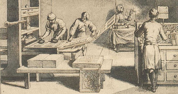


Fig. 2 Illustration of 13th century printing press https://flex.falmouth.ac.uk/courses/1165/pages/week-10-lecture?module_item_id=63447
Fig. 3 Illustration of printers cases https://flex.falmouth.ac.uk/courses/1165/pages/week-10-lecture?module_item_id=63447
The apparatus used for printing was modelled on the design of screw presses and used the similar mechanisms found in wine presses, papermaker presses and linen presses. On average, the device would help to create 3,600 pages per workday, which not only helped to quicken the production of the books, but it had drastically reduced the overall cost, making them a lot more accessible.
This soon helped the development of more revolutionary technology which enabled the mass production of books and the propagation of knowledge across the globe.
Modern Era
Bauhaus
The Bauhaus is a German artistic movement (and design school) that started around 1919 and was dominant throughout the 20's and early 30's. The school was created by Walter Gropius and many have credited the Bauhaus School for the development and evolution of contemporary graphic and industrial design.
Fig. 4- Image is by Tadashi Okochi. https://www.dezeen.com/2018/11/06/herbert-bayer-bauhaus-100-typography-universal-typeface-font/
During this time, Herbert Bayer created a sans serif type which has since been used as Bauhaus' typographic identity. Because of this, the Bauhaus design is quite recognisable-not just because of the font, but because of the lack of capital letters. Bayer had argued the idea that the distinction between the upper and lower cases is inherently classist and that there should only ever be one case.

Fig. 5-Image by Tobias Adam. https://www.dezeen.com/2018/11/06/herbert-bayer-bauhaus-100-typography-universal-typeface-font/
Looking at the Bauhaus designs, it is very clear in terms of how this movement had influenced design of the present day- especially regarding typography.
Theory
Beatrice Warde
Beatrice Warde used the analogy of the crystal goblet to elaborate on her view that 'printing should be invisible'. She argues that when drinking from a goblet, you want to be able to see what it is that you're consuming- whereas the more ornaments, flourishes and design the goblet has, the less it allows you to see- and furthermore to understand.
I personally do not entirely agree with this theory because I believe that typography can be used as both a form of communication and an art form. I can agree to an extent that it should be clear or 'invisible'- but it is entirely dependent on the context of the design piece.
Workshop Challenge
Take an excerpt from a national poet or writer and transform the text into a single typographic composition;
Redesign the first line of text in a style that’s appropriate to the subject - draw it, render it, build it;
Then take the body of the text and typeset it.
Be experimental. How does leading, positioning, stresses on particular words and detailing affect the power of the piece?
How is meaning affected by interpretation in a tangible way?
What is the relationship of the page?
Chosen Excerpt
Small Female Skull by Carol Ann Duffy
With some surprise, I balance my small female skull in my hands.
What is it like? An ocarina? Blow in its eye.
It cannot cry, hold its breath only as long as I exhale,
mildly alarmed now, into the hole where the nose was,
press my ear to its grin. A vanishing sigh.
For some time, I sit on the lavatory seat with my head
in my hands, appalled. It feels much lighter than I'd thought;
the weight of a deck of cards, a dlim volume of verse,
but with something else, as though it could levitate. Disturbing.
So why do I kiss it on the brow, my warm lips to its papery bone,
and take it to the mirror to ask for a gottle of geer?
I rinse it under the tap, watch dust run away, like sand
from a swimming cap, then dry it - firstborn - gently
with a towel, I see the scar where I fell for sheer love
down treacherous stairs, and read that shattering day like braille.
Love, I murmur to my skull, then, louder, other grand words,
shouting the hollow nouns in a white-tiled room.
Downstairs they will think I have lost my mind. No. I only weep
into these two holes here, or I'm grinning back at the joke. This is
a friend of mine. See - I hold her face in trembling, passionate hands.
Research
With this poem in mind, I decided to list all the prominent themes that come to mind when reading/ analysing this poem- I believe that in understanding the general context and themes of the poem that it will help me get inspired and come up with ideas for the typography,
Themes:
Drunkenness
Sobriety
Exhaustion
Honesty
Shame
Fragility
Regret
Self Love
Overall, I wanted to play on the overarching theme of drunkenness because I felt it would help to elaborate on the context, linguistic choices and the general pace and flow of the poem. The idea I had was that I would use aspects of the Dadaism style and would play around with different fonts, sizes, formats and movements to represent that feeling of being drunk (and the process of sobering up).
I believe that the nonsensical and irrational style of Dadaism would really help me to get that feeling/ sensation across.
Dadaism
A style that Kristoffer had mentioned in the lecture was Dadaism- which is an art movement that started around 1915-1920- during the First World War. He described it as an 'extremely free use of type' that was supposed to be random and meaningless- which in general, after hearing about the guidelines and rules for the Bauhaus style, was something I found really interesting.

Fig. 6- Raoul Hausmann
The Art Critic (1919–20) https://www.tate.org.uk/art/art-terms/d/dada
I decided to do a bit more research into Dadaism as I wanted to know more about how this style came into fruition.
It is often seen as satirical or nonsensical in nature and was a way for many artists and designers to express their emotions- especially devastation, trauma and anger as a direct reaction to the horrors many had faced throughout the Great War.
Dadaism was a way for many to reject realism and the 'traditional values' of art and had soon formed the basis for Surrealism.
What I like about Dadaism in relation to typography, is that it utilises more creative, weird and nonsensical features in order to reject the traditional and the 'beautiful'. Although it claims that is created without any meaning, to me it contains a lot of emotion within its spontanious and irrational style- by using different mismatching fonts, bold colours, spontaneous direction, random images/ symbols and movement.
Overall, I find this incredibly effective and interesting and with the poem that I have in mind for this weeks workshop challenge, I believe that this style will allow me to elaborate on the poems key themes.
Development
I decided that the first thing I needed to do was work on the typography itself. Using my inspiration and references I decided to be very playful and nonsensical with the format- alternating fonts, creating weird and wavy movement, italicising, making things bold, making words wider and shorter. Overall, not only did I really enjoy the freedom of it, but I felt it really emphasises on the primary sensation, feeling and theme of the poem.

Having studied a bit of poetry in 6th form, I also wanted to make the typography emphasise and reflect upon the pace, flow and linguistic choices of the poem.
I also decided to make the typography less hectic/ wavy towards the end- as a way to reflect upon the process of sobering up- the vulnerability and fragility you may feel when you regain back your identity.
Overall, I felt like the dada style really helped me to achieve what it was I wanted. However I knew that I couldn't just leave it bare- that I could go a step further and make it a slight bit weirder.

My idea for the rest of the design, was to make it look like a bit of a hectic mess. To use letters, shapes, and little bits of illustration to really place on that dada style- but without drawing too much attention from the poem/ typography. Instead I pinpointed words, and created illustrations that revolved heavily around the poem itself.
I didn't think too heavily upon the purpose behind everything I added to the piece- but overall I think that lack on complete understanding has really aided in its overall look and feel.
Reflection
I came into this weeks challenge only really knowing the basics of typography, and although I had an inkling as to how effective it can be when trying to get across a certain style, feeling, or context- it was through this challenge that I really got the chance to see how typography can be used, not just as an element of design, but as a form of art/design in an of itself.
Drawing a lot of inspiration from the nonsensical dada style has allowed me to play around not only with different fonts and formats, but it has allowed me to play around with movement- all to get across the wobbly feeling of being inebriated, and that feeling of uneasiness and vulnerability as you're trying to sober up.
In conclusion, I'm definitely looking forward to exploring how typography can be used to elaborate further on different styles, emotions, and meanings- and I hope in the future, I get the opportunity to do this kind of exercise again.
References
Astbury , J. (2018) Herbert Bayer: Creator of the Bauhaus' Universal Typography, Dezeen. Dezeen. [Online] Available at: https://www.dezeen.com/2018/11/06/herbert-bayer-bauhaus-100-typography-universal-typeface-font/ (Accessed: April 3, 2023).
Duffy, C.A. (2011) New Selected Poems. London: Picador.
Soelling,K. (2023) Regular Practice – Typography. Falmouth Flexible. [Online] Available at: https://flex.falmouth.ac.uk/courses/1165/pages/week-10-lecture?module_item_id=63447 (Accessed: April 3, 2023).
Moriarty, A. (2016) The Modern Letter - the Best of the Bauhaus Typography, Widewalls. Widewalls. [Online] Available at: https://www.widewalls.ch/magazine/bauhaus-typography (Accessed: April 3, 2023).
Tate (no date) Dada, Tate. Available at: https://www.tate.org.uk/art/art-terms/d/dada (Accessed: April 3, 2023).


link link link link link link link link link link link link link link link link link link link link link link link link link link link link link link link link link link link link link link link link link link link link link link link link link link link link link link link link link link link link link link link link link link link link link link link link link link link link link link link link link link link link link link link link link link link link link link link link link link link link link link link link link link link link link link